

Red is bad, green is good, blue is not statistically different/neutral.
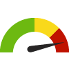
 the value is in the best half of communities.
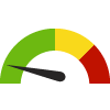
 the value is in the 2nd worst quarter of communities.
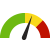
 the value is in the worst quarter of communities.
 meets target;
  does not meet target.
 lower than the comparison value;
 higher than the comparison value;
 not statistically different from comparison value.

 non-significant change over time;
 significant change over time;
  no change over time.
 higher than the previous measurement period;
 lower than the previous measurement period;
 no statistically different change from previous measurement period.
 Significantly different than the overall value
 No significant difference with the overall value
 No data on significance available
This indicator is archived and is no longer being updated. Click to learn more
Filed under: Health / Family Planning, Women